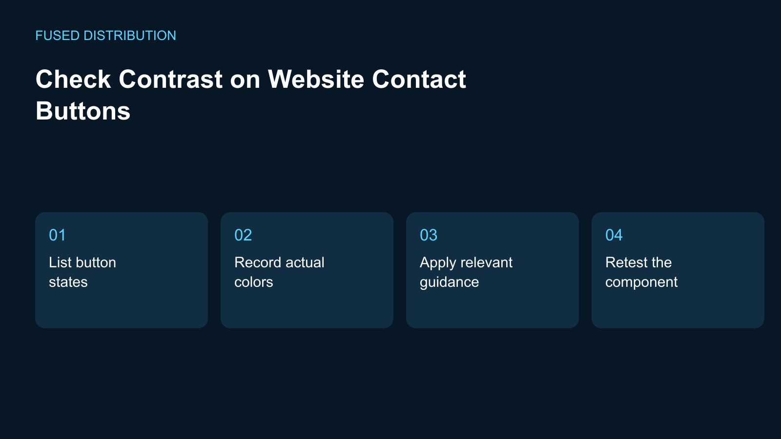
List button states → Record actual colors
Apply relevant guidance → Retest the component
Check a contact button where customers actually see it, including the page background, the text inside it, and its visible interaction states. Record the page and component before measuring anything. A color pair in a brand document may not match a button displayed over a photograph or gradient. Treat the review as a specific test of the published component, not a judgment based only on whether the design looks bright.
List contact button states to inspect
Identify the ordinary button appearance and the states shown during keyboard focus, pointer interaction, and any active selection. Include a disabled state only where the form or application actually uses one, and keep its behavior distinct from an available action. Ask the developer which styles are applied in each state. A single screenshot can miss the point where the wording becomes difficult to distinguish from its background.
Record the actual colors and context
Have the developer identify the rendered foreground and background colors, including opacity or a layered background that changes the result. Use a contrast measurement tool to record the relevant pair and the measured result. Keep the font size and weight with the observation so the appropriate text requirement can be assessed. Do not substitute a guessed color from a compressed screenshot when the actual style values are available.
Use the relevant guidance for the decision
W3C distinguishes text contrast requirements by text size and includes specific exceptions. Ask the person reviewing accessibility to apply the relevant requirement to the actual button rather than choosing a convenient threshold. Keep text contrast, the visibility of the control boundary, and keyboard focus appearance as separate questions. A pass on one question should not be copied into the other fields without checking their different purposes.
Repair the component and repeat the task
Agree on a change that keeps the contact action recognizable within the brand, then test the deployed component again in each recorded state. Follow the button to its intended destination as part of the check. If it appears on several page templates, include examples with different backgrounds. Record the final measured result and any remaining issue instead of closing the task merely because the color token changed in the design file.
Keep the evidence with the design decision
Save the page, date, states, color values, measurement method, and reviewer decision with the component record. Link the issue to the relevant style or design token so a future brand update can repeat the same checks. This focused review does not establish whole-site accessibility or legal compliance. It gives the team a practical, repeatable record for keeping an important customer action readable when the visual design changes.
For related preparation, see our Website link testing. Use the Website change records to connect this check with the wider record.
Source context: W3C accessibility guidance. The checklist above is a suggested working method; record your own observations rather than assuming an outcome.
Related
Read next: Website link testing.