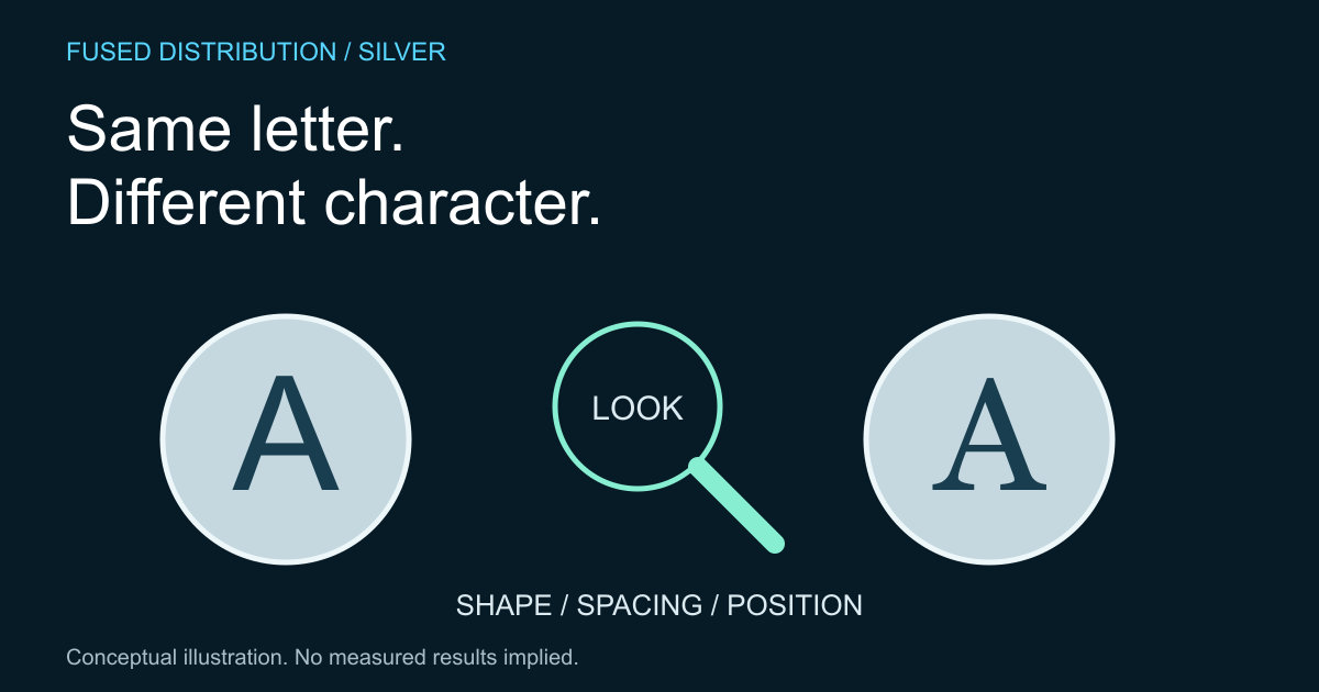
Describe the letters before naming a style → Compare spacing and placement
Separate appearance from production claims → Keep a comparison sheet
Lettering can change the character of a coin design even when the main image is similar. Compare the shape, spacing and placement of the letters before deciding what those differences mean. A visual comparison is an observation exercise, not a way to authenticate a coin or estimate its price.
Photograph both pieces at a similar scale, angle and lighting level. Keep an original image as well as any crop. If glare hides part of a letter, mark it as unclear instead of completing the shape from memory. Record which face and orientation you are examining so another person can reproduce the comparison.
Describe the letters before naming a style
Look at the ends of strokes, their apparent thickness, the proportions of rounded letters and the treatment of corners. Choose a repeated letter to compare across the inscriptions. Plain descriptions such as narrow, rounded or widely spaced are often more useful than an uncertain typeface name.
Do not assume an engraved inscription corresponds exactly to a modern computer font. The U.S. Mint anatomy guide identifies inscriptions and the legend as parts of coin design; it does not identify the typeface of every product. If a designer or issuer names a lettering style, preserve that source separately from your own description.
Compare spacing and placement
Notice how the inscription follows the rim and how it relates to the central image. Are gaps similar between letters, or does one pair look tighter? Record the position of the feature you mean. A simple annotated copy of a photograph can explain your observation more clearly than a broad statement that one design looks better.
Remember that lighting, viewing angle and surface condition affect what a photograph reveals. Apparent differences deserve a second view before they become a conclusion. Our coin photography guide explains keeping images connected to the correct inventory record.
Separate appearance from production claims
A different looking stroke does not by itself explain how or why the object was made. Avoid jumping from an interesting letter to an attribution, variety name or manufacturing fault. Those are separate claims that need appropriate evidence and, when necessary, qualified review.
For background on the transfer of a design, read how coin dies work. That context can improve the questions you ask, but a general production explanation cannot identify the cause of a mark on your particular piece. Keep that boundary visible in any public caption.
Keep a comparison sheet
Use one entry for each observation: object identifier, image reference, letter or word, visible feature, confidence and supporting source. Write an unresolved question when the evidence is incomplete. Do not alter or clean an object just to make a photograph fit a proposed explanation.
Finish by describing what you prefer about the design in ordinary language. Personal taste does not require a market claim. You might like generous spacing or a strong relationship between the text and image. A careful comparison gives that preference a clear basis while leaving identification and value questions open.
Sources
- U.S. Mint anatomy guide. Source context is distinguished from the original practical method above.
Related
Read next: How to photograph silver coins for an inventory.